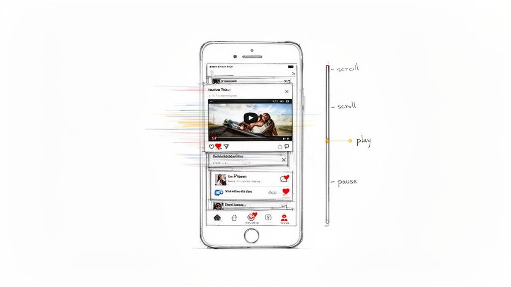
When a user scrolls down a webpage and a video plays, pauses, or even scrubs frame-by-frame in sync with their movement, that's what we call a video scrolling website. You’ve seen this everywhere, especially on social media feeds. It’s a slick technique that turns a passive video into an interactive experience, and it's a fantastic way to grab a user's attention right away.
Why You Need to Master Scroll-Driven Video
Let's face it: platforms like TikTok and Instagram have completely rewired user expectations. What used to be a novel trick is now an expected part of a modern, engaging website. Knowing how to build these scroll-driven video experiences isn't just a "nice-to-have" anymore; it's a core skill for any developer building for the modern web.
This guide is designed to get you building, fast. We'll skip the fluff and dive straight into the practical code you need—from the initial HTML and CSS setup to controlling playback with JavaScript's Intersection Observer.
The Numbers Don't Lie
The shift to video is massive. It now makes up 65% of all internet traffic globally. On scroll-heavy platforms, the engagement is off the charts—TikTok users spend an average of 52 minutes a day on the app.
For businesses, the impact is direct. A staggering 83% of video marketers say video increases the time visitors spend on their sites. You can dive into the full research on these digital trends to see just how much video is reshaping user behavior.
This is about more than just a cool visual effect. It’s about building a skill that demonstrably boosts user dwell time and engagement—metrics that matter to any business.
We're going to cover the topics that separate a choppy demo from a professional, polished implementation:
- Performance Optimization: How to make sure your video loads fast and scrolls buttery-smooth without janking up the page.
- Accessibility: Creating an inclusive experience that works for everyone, especially users with motion sensitivities.
- Automated Testing: Setting up workflows to guarantee your effect works perfectly across all browsers and devices, now and in the future.
By the time you're done, you'll have everything you need to build this feature with confidence.
Building Your First Scroll-Triggered Video
Alright, let's roll up our sleeves and actually build this thing. The core of any scroll-triggered video effect is a solid, well-structured HTML foundation. It all starts with the <video> element, but a few key attributes make all the difference between a smooth effect and a clunky mess.
First, get the basics in place. You'll absolutely need to include muted and playsinline. These are non-negotiable for getting video to autoplay in modern browsers, especially on mobile, where nobody wants a video blasting sound without their permission.
I’ve also added loop here, which is great for short, atmospheric videos that you want to repeat seamlessly in the background. Notice the two <source> elements? That's a crucial best practice. It lets the browser choose the most efficient format it can handle—we offer the modern WebM format first, then provide an MP4 as a universal fallback.
Styling the Video and its Container
With the HTML structure down, let's turn to CSS to get the positioning right. A really common goal is to create a full-screen background video that stays put while content scrolls over it. The simplest way to achieve this is by fixing the container to the viewport.
.video-container { position: fixed; top: 0; left: 0; width: 100%; height: 100vh; z-index: -1; /* This is the key to putting it in the background */ overflow: hidden; }
video { width: 100%; height: 100%; object-fit: cover; /* Prevents the video from being stretched or squished */ }
The two properties doing the heavy lifting here are z-index: -1 and object-fit: cover. The z-index pushes the entire video container behind all your other page content. Then, object-fit: cover tells the video to fill the entire container, cropping itself cleanly as needed without distorting the aspect ratio. It’s a bulletproof combo.
Making It Interactive with JavaScript
Now for the fun part—bringing it to life with JavaScript. Your first instinct might be to listen for the scroll event, but trust me, that's a performance trap. A much better, more modern approach is to use the Intersection Observer API. This lets the browser do the hard work of watching for when an element enters or leaves the screen.
Here’s a great visualization of how it works.
As the diagram from MDN shows, the API simply watches a "target" element and tells you when it crosses into a "root" area, which for us is just the browser viewport.
Our logic is simple: when the video comes into view, we play it. When it goes out of view, we pause it. This not only creates the intended effect but also saves a ton of battery and CPU, since the video isn't running when no one can see it.
Expert Tip: Ditch the old-school scroll event listeners for visibility checks. The Intersection Observer is built for this exact task. It's far more performant because it lets the browser optimize the detection process, preventing the kind of lag that can make a site feel janky.
Let’s see what that looks like in practice. First, grab the video element and set up our observer.
const video = document.querySelector('video');
// Observer configuration const options = { root: null, // this means we're watching relative to the viewport rootMargin: '0px', threshold: 0.1 // fire the event when 10% of the video is visible };
const observer = new IntersectionObserver((entries) => { entries.forEach(entry => { // Is the video element in view? if (entry.isIntersecting) { video.play(); } else { video.pause(); } }); }, options);
// Start observing the video element observer.observe(video);
This snippet sets up an observer to watch our video. The threshold: 0.1 tells it to trigger the callback once at least 10% of the video becomes visible. Inside the callback, we check the isIntersecting property. If it's true, we call video.play(). If it's false, we video.pause(). Simple, elegant, and efficient.
This setup is the perfect starting point for a basic play/pause effect. From here, you can get much more advanced, like scrubbing through the video's timeline as the user scrolls. It's just one way to make a video of your website scrolling to create a truly memorable user experience.
Mastering Performance for a Flawless User Experience
Nothing kills the magic of a scroll-driven video faster than stuttering or freezing. A laggy animation completely shatters the immersive experience you're trying to build and sends visitors scrambling for the back button. The best video scrolling website examples feel completely effortless, and that fluidity comes down to smart, deliberate optimization.
The biggest performance killer, without a doubt, is the video file size. Gigantic files are the number one cause of slow initial loads and choppy playback. Your job is to strike a delicate balance between visual quality and file size, which all starts with picking the right video format.
To deliver that seamless experience, you have to get serious about your media. Learning how to effectively reduce video file size is non-negotiable. It's about more than just picking a format; it's about thoughtful compression that sheds megabytes without sacrificing too much quality.
Choosing the Right Video Format
The format you choose has a massive impact on both file size and browser compatibility. Here’s a quick rundown of the most common web video formats to help you decide.
Video Format Comparison for Web Performance
| Format | Compression Efficiency | Browser Support | Best For |
|---|---|---|---|
| WebM | Excellent | Very Good (All modern browsers except Safari) | High-quality video where file size is critical. Great for Chrome, Firefox, Edge. |
| MP4 (H.264) | Good | Universal | The safest bet for maximum compatibility across all browsers, including older ones. |
| AV1 | The Best | Good (Growing support, but not yet universal) | The future of web video. Use it when you need the absolute best compression, but provide fallbacks. |
| HEVC (H.265) | Excellent | Limited (Primarily Safari) | Great for Apple-centric ecosystems, but requires a fallback for other browsers. |
For most projects, using MP4 as a universal fallback and providing a WebM or AV1 version for supported browsers is a solid strategy. This progressive enhancement ensures everyone gets a good experience.
Smart Loading Strategies
Even after you've compressed your video, never load it with the initial page render. This is a classic mistake that blocks critical resources and destroys your Core Web Vitals scores. The solution? Lazy loading.
A simple and highly effective approach is to use the poster attribute on your <video> tag. You point it to a low-resolution placeholder image that displays while the actual video downloads. This gives the user an immediate visual cue, making the page feel loaded and responsive long before the heavy video asset is ready.
You can take this a step further with a bit of JavaScript. Don't set the video's src attribute in your HTML. Instead, wait until the video element is about to scroll into the viewport, and then inject the source. This is the ultimate lazy-loading technique—the browser won't download a single byte of video data until it's absolutely necessary.
A great user experience is built on perceived performance. A lightweight poster image creates an instant visual cue, assuring the user that content is loading correctly while the heavier video asset downloads in the background.
This diagram breaks down the core components needed to build a performant scroll-controlled video.
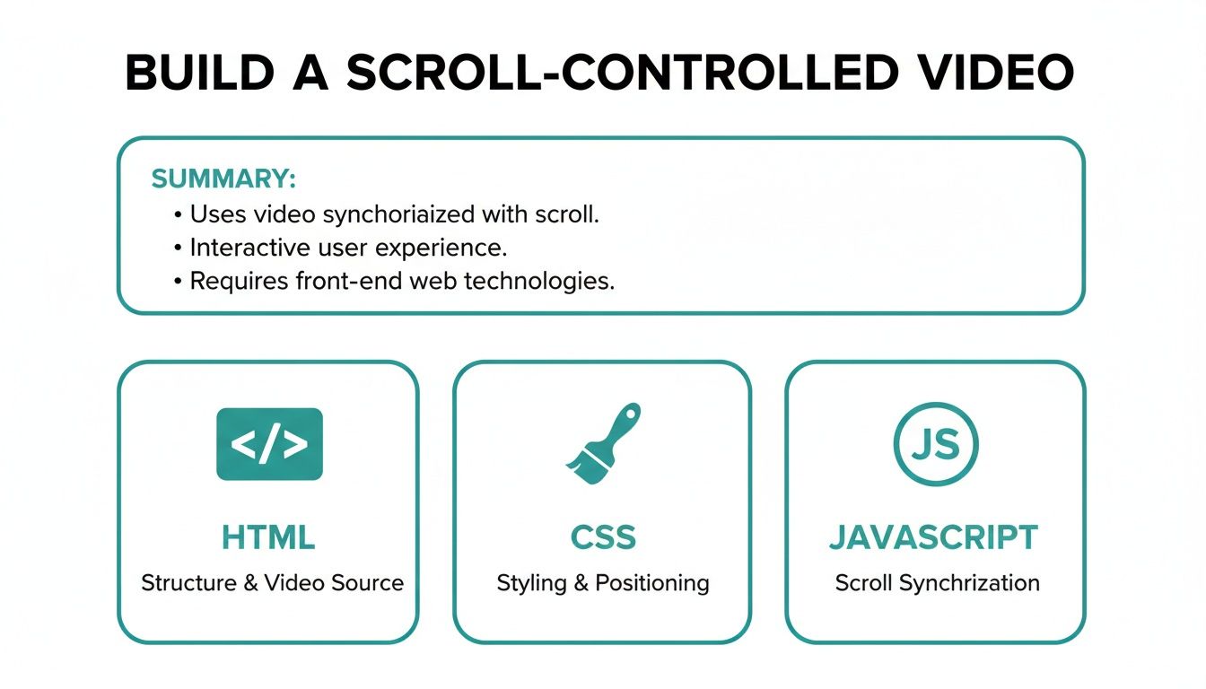
Each layer—from the HTML structure to the CSS styling and JavaScript interactivity—is crucial for delivering a smooth, engaging final product.
Don't Forget Mobile Devices
Mobile performance is a completely different beast. Slower network connections and less powerful hardware mean an effect that's silky-smooth on a desktop can become an unusable, janky mess on a phone. The best practice here is often to disable the effect entirely for mobile users and provide a simpler fallback.
A quick JavaScript check based on viewport width is all you need:
if (window.innerWidth < 768) { // On smaller screens, maybe just show the poster image // and disable the scroll-triggered playback logic. } else { // Initialize the Intersection Observer for larger screens. }
This ensures your cool feature doesn't compromise the core user experience on less capable devices. When businesses get this right, the results are significant: product pages with this kind of effect have seen 47% higher engagement and a 35% reduction in returns.
By combining aggressive compression, clever lazy-loading, and thoughtful mobile fallbacks, you can build a video scrolling effect that not only looks incredible but performs flawlessly for every single user.
Making It Accessible and SEO-Friendly
A scroll-driven video effect is cool, but it's not truly successful unless everyone can use it and search engines can find it. A great implementation doesn't just look amazing; it’s inclusive, performant, and built to reach the widest audience possible.
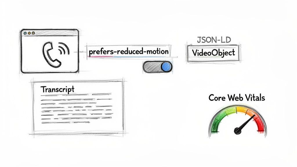
This means you can't just tack on accessibility at the end—it has to be baked in from the start. Plenty of people use screen readers or are sensitive to motion, and we need to build with their experience in mind. The absolute baseline is providing clear text alternatives and transcripts for your video content.
If you're new to it, learning about adding captions to videos is a huge step. Captions don't just help users with hearing impairments; they're also a lifeline for anyone watching in a loud place or with their sound off. It's a win for everyone.
Respecting User Preferences
For an effect like this, motion sensitivity is a massive accessibility concern. Over-the-top animations can trigger real physical discomfort, like vertigo, for some people. The good news is that CSS gives us a straightforward tool to handle this: the prefers-reduced-motion media query.
It's a simple, elegant way to respect user settings. Just wrap your animation logic inside the query.
@media (prefers-reduced-motion: no-preference) { /* All your scroll-driven animation styles go here */ .video-container { animation: scroll-fade-in linear; animation-timeline: view(); } }
By doing this, you're telling the browser to only apply these motion effects if the user hasn't explicitly requested less motion in their OS settings. For everyone else, the site gracefully degrades to a static, comfortable experience.
Helping Search Engines Find Your Video
Now for the SEO side. You can't just assume search engines will understand what your video is about. You need to give them explicit clues, and the best way to do that is with VideoObject schema markup.
Think of
VideoObjectschema as your direct line of communication with search crawlers. It's a chunk of JSON-LD code where you can spell out the video's title, duration, thumbnail, and description. This can seriously boost how your content shows up in search results.
Make sure your schema includes these key properties:
name: The video’s title.description: A quick summary of what the video is about.thumbnailUrl: The URL for the poster image.uploadDate: The date the video went live.duration: The video's length in ISO 8601 format (e.g., "PT1M30S" for 90 seconds).
Finally, don't forget that all the performance work we did earlier—lazy loading, video compression—has a direct impact on your Core Web Vitals. Google uses these scores as a ranking signal, so a fast, smooth-scrolling site isn't just a nicety for users. It's a core part of modern SEO. If you want to dive deeper into optimizing visuals for crawlers and social platforms, check out our guide on Open Graph image examples, which covers some similar ground.
Automating Visual Tests for Your Video Website
You've finally nailed that complex, scroll-based video animation. It's working perfectly. But how do you make sure it stays that way after the next code push? Or when Chrome releases a new update? Manually testing a feature like this is a nightmare—it’s repetitive, tedious, and frankly, you're going to miss things.
This is exactly where traditional unit or integration tests start to fall apart. Sure, they can confirm your JavaScript functions are firing, but they have no idea if a video frame is misaligned by ten pixels or if a subtle CSS tweak just created a jarring visual glitch. For a video scrolling website, the visual experience is the feature.
Moving Beyond Manual Checks
Automated visual regression testing is the answer. Instead of a human scrolling up and down, you programmatically capture screenshots of your site at key points and compare them against a "golden" baseline image. If any pixels differ, the test fails. This immediately flags unintended visual bugs before they ever have a chance to get in front of a user.
This approach is tailor-made for scroll-linked animations. You can build a test suite that captures the page at various scroll depths—say, at 25%, 50%, and 75% of the way down. This ensures the video playback stays perfectly locked to the user's scroll position every single time.
A solid visual testing strategy transforms quality assurance from a manual chore into a reliable, automated part of your CI/CD pipeline. It’s the safety net that lets you ship complex visual features with confidence.
A Practical Testing Scenario
Tools like ScreenshotEngine are designed for exactly this kind of task. Its API lets you automate the entire workflow. If you want to get a better sense of the landscape, it's worth reading up on the different visual regression testing tools available.
Let's walk through a real-world scenario. To verify your animation, your automated script would make a series of API calls:
- Capture at 0% scroll: First, take a baseline screenshot of the initial, above-the-fold view.
- Capture at 50% scroll: Next, send another request, but this time, instruct the API to scroll halfway down the page before taking the shot. This confirms the video has advanced to its midpoint as expected.
- Capture at 100% scroll: Finally, capture the view at the very bottom of the page to check the animation's end state.
Here's a pro tip from the trenches: use API parameters to block dynamic elements that can wreck your tests. Things like cookie banners, live chat widgets, or third-party ads often cause false positives because they change between test runs. Blocking them keeps your tests clean, consistent, and focused only on the component you’re actually trying to validate. This is how you make visual testing a truly dependable part of your development process.
Answering Your Toughest Scroll-Linked Video Questions
Even when you've got the basics down, you're bound to run into some tricky situations. Building these kinds of sites is one of those things where the last 10% of the work takes 90% of the effort. Let's walk through a few of the most common "what if" scenarios I see developers get stuck on.
How Do I Juggle Multiple Videos on the Same Page?
Putting several scroll-triggered videos on one page is a classic performance trap. The brute-force way is to create a separate IntersectionObserver for each video, but that's a surefire way to bog down the main thread.
The smarter, much more efficient approach is to use a single observer to watch all your video elements. Think of it as one security guard watching multiple monitors instead of hiring a separate guard for each screen.
When the observer's callback runs, you can easily figure out which video just entered or left the viewport by looking at the entry.target property. This lets you play or pause the right video at the right time. And always, always pause videos once they scroll out of view—it's the single best thing you can do to keep the user's browser happy.
Can I Make a Huge Video File Feel Smooth?
Yes, you absolutely can, but you have to be relentless with your optimizations. A massive, unoptimized video file is the most common reason these effects feel choppy or just plain broken. It's not magic; it's just a strict optimization process.
Here’s the playbook I follow:
- Aggressive Compression: Fire up a tool like HandBrake and crush that file size. Modern formats like WebM are your best friend here due to their fantastic compression, but don't forget an MP4 fallback for broader compatibility.
- Serious Lazy-Loading: The video should never, ever start downloading on the initial page load. It should only begin fetching when it gets close to entering the viewport.
- Get it on a CDN: Serving videos from a Content Delivery Network (CDN) is non-negotiable. This drastically cuts down latency, which makes a huge difference, especially for users far from your server.
The whole point is to make the video feel completely weightless to the user. Nail these three things—compression, smart loading, and a CDN—and you'll get that buttery-smooth effect you're after.
What’s the Best Fallback for Old Browsers?
While IntersectionObserver is supported almost everywhere these days, you might still have a project requirement to support something ancient like IE11. The old-school way was to listen for every scroll event and constantly call getBoundingClientRect(), which is a performance nightmare. Don't do it.
A much cleaner solution is to simply use a battle-tested polyfill for the Intersection Observer API. This lets you write clean, modern code and let the polyfill do the dirty work of handling the inefficient logic for legacy browsers. It's the best of both worlds: your main script stays pristine, and your feature still works for those few users on older tech.
At ScreenshotEngine, we've built a developer-first API to capture pixel-perfect screenshots for visual testing and monitoring. It’s the perfect way to make sure your scroll-linked video effects stay flawless across deployments. Test the ScreenshotEngine API for free.